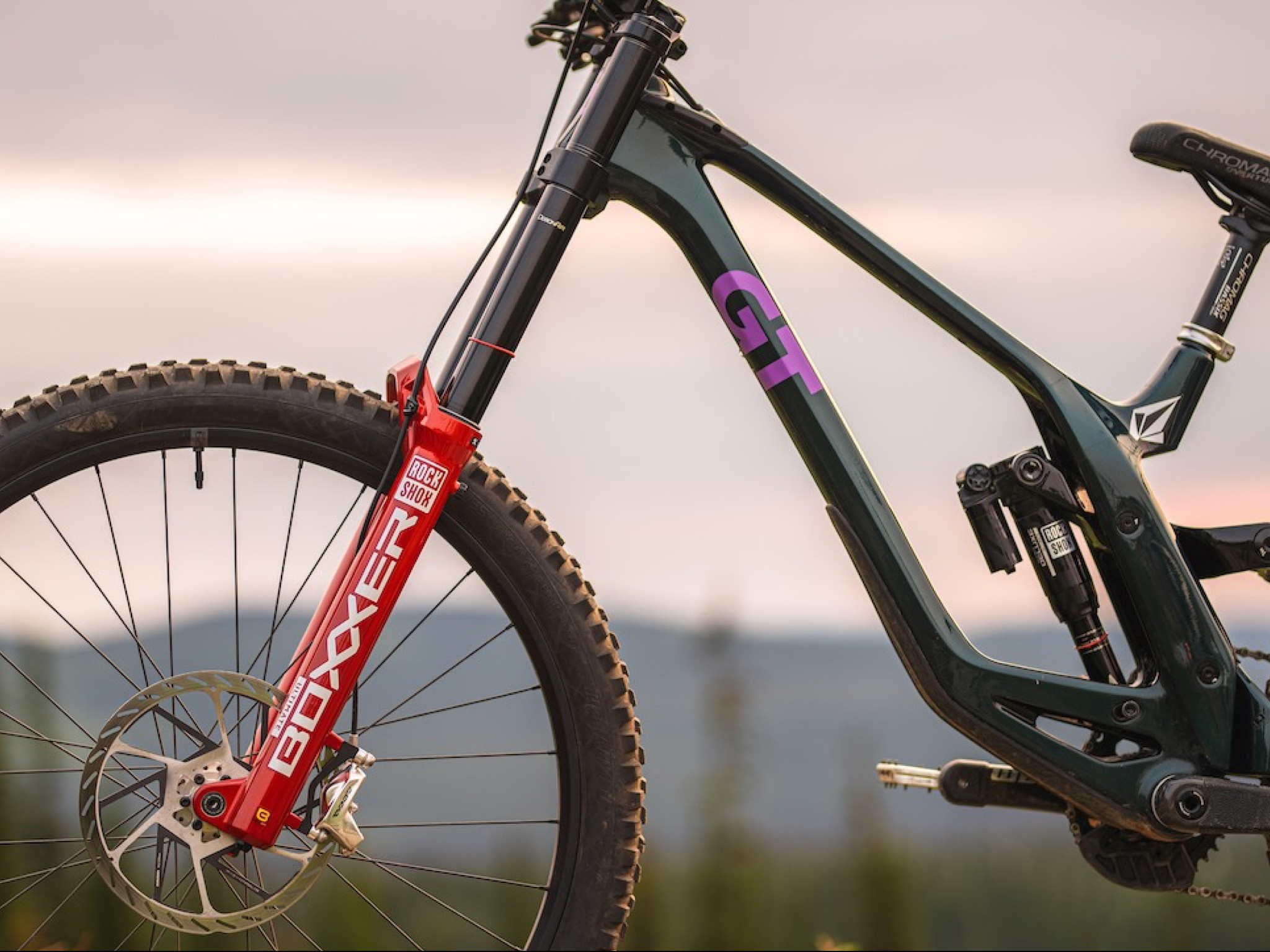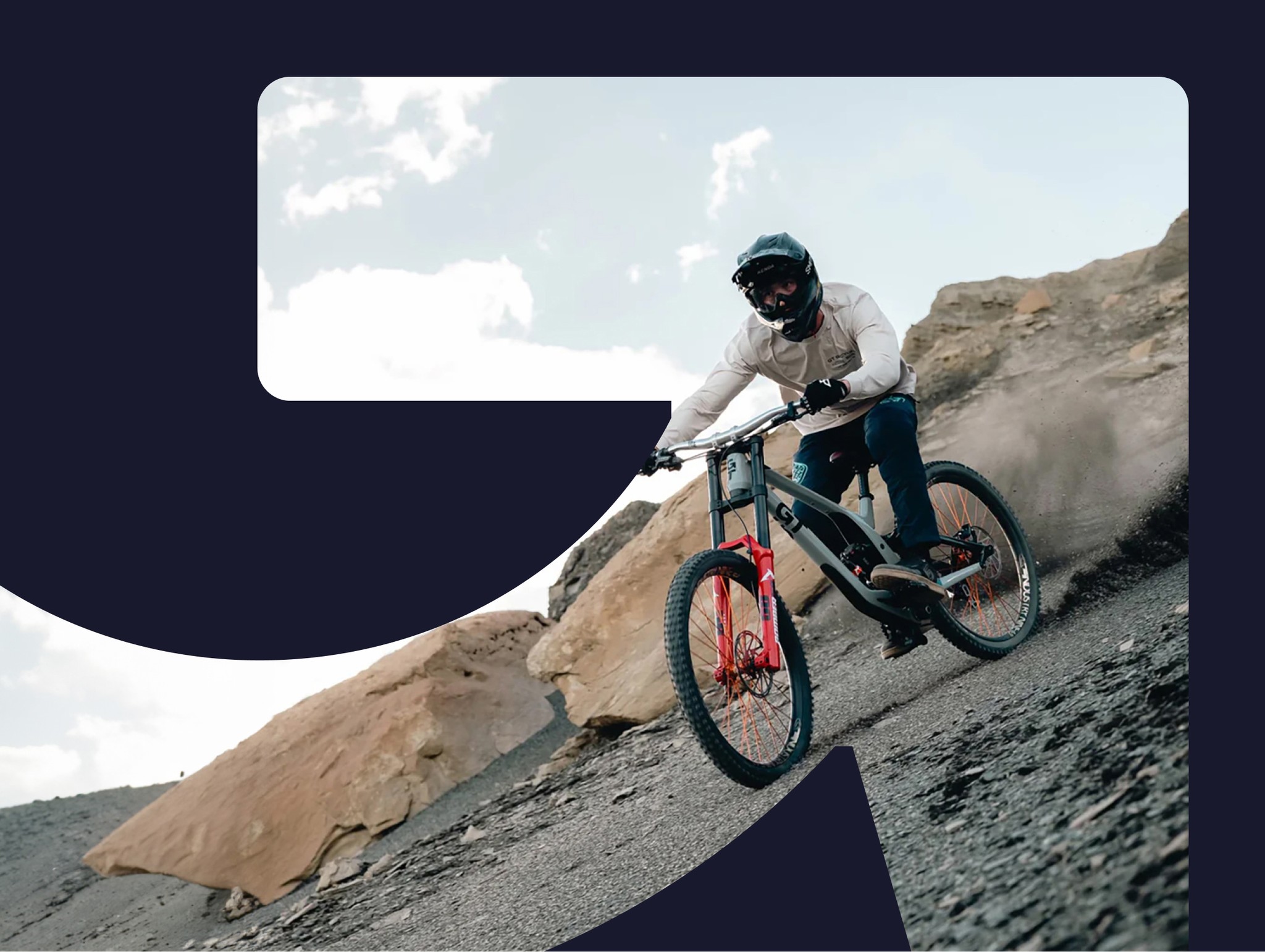
brand identity
Role
Creative Director
Background
Traditionally operating solely as a B2B company within the snow and cycling category, BOA looked to open their aperture while speaking directly with the end-user of their products. With a new brand positioning unlocked, “Fit to Go Further,” along with a completely from the studs up brand identity and logo, the new system aimed to seamlessly scale from the smallest products to consumer-facing marcom needs.
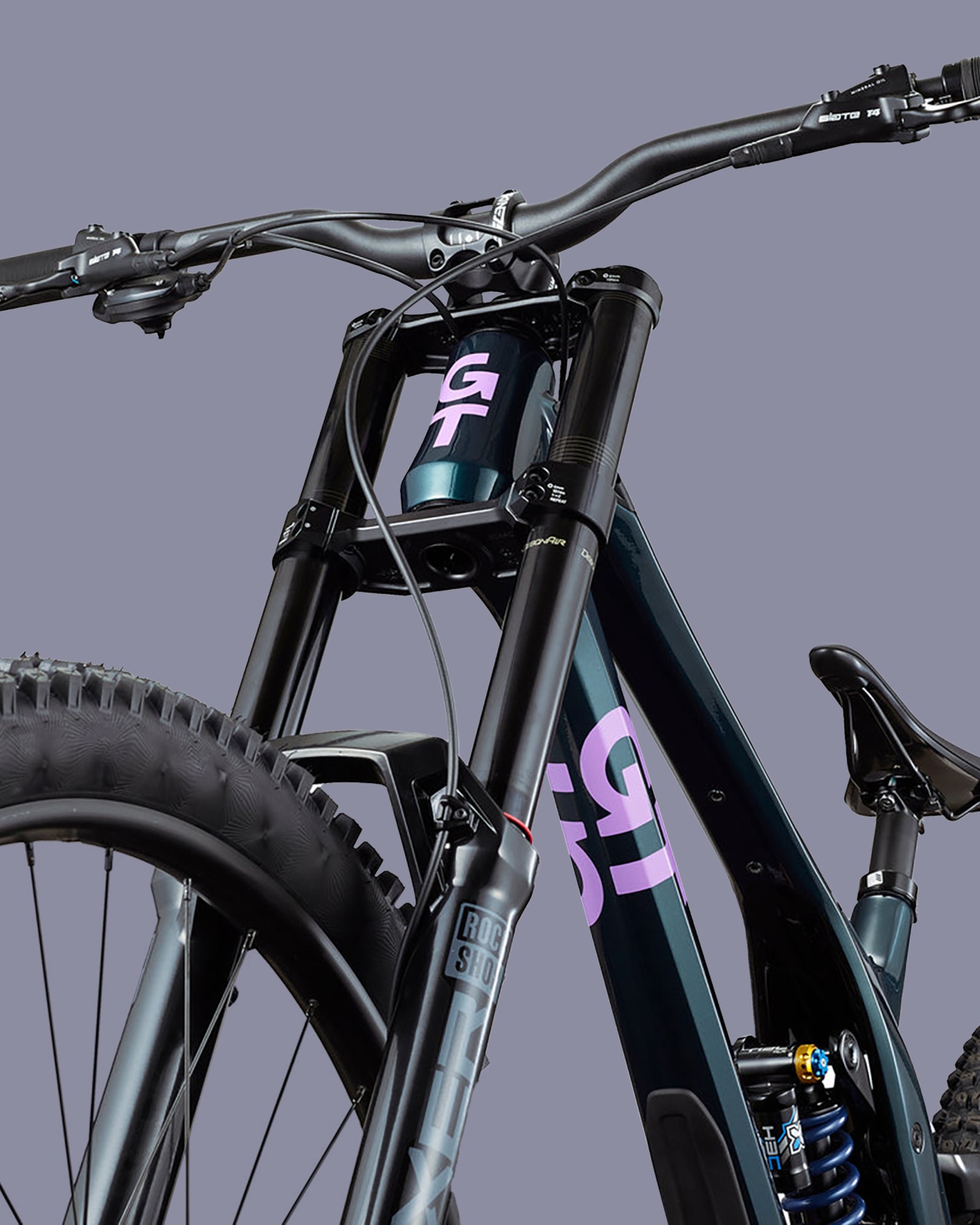
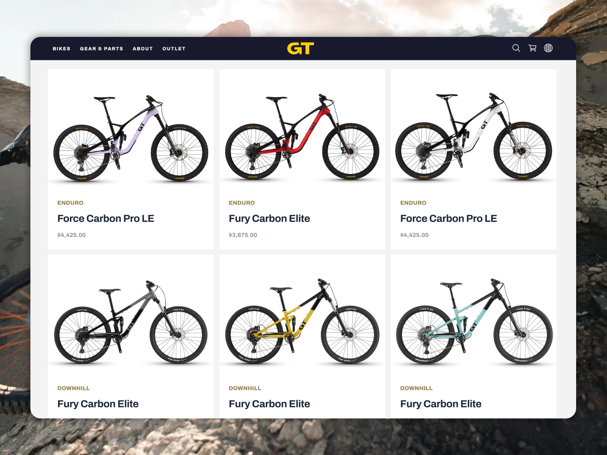
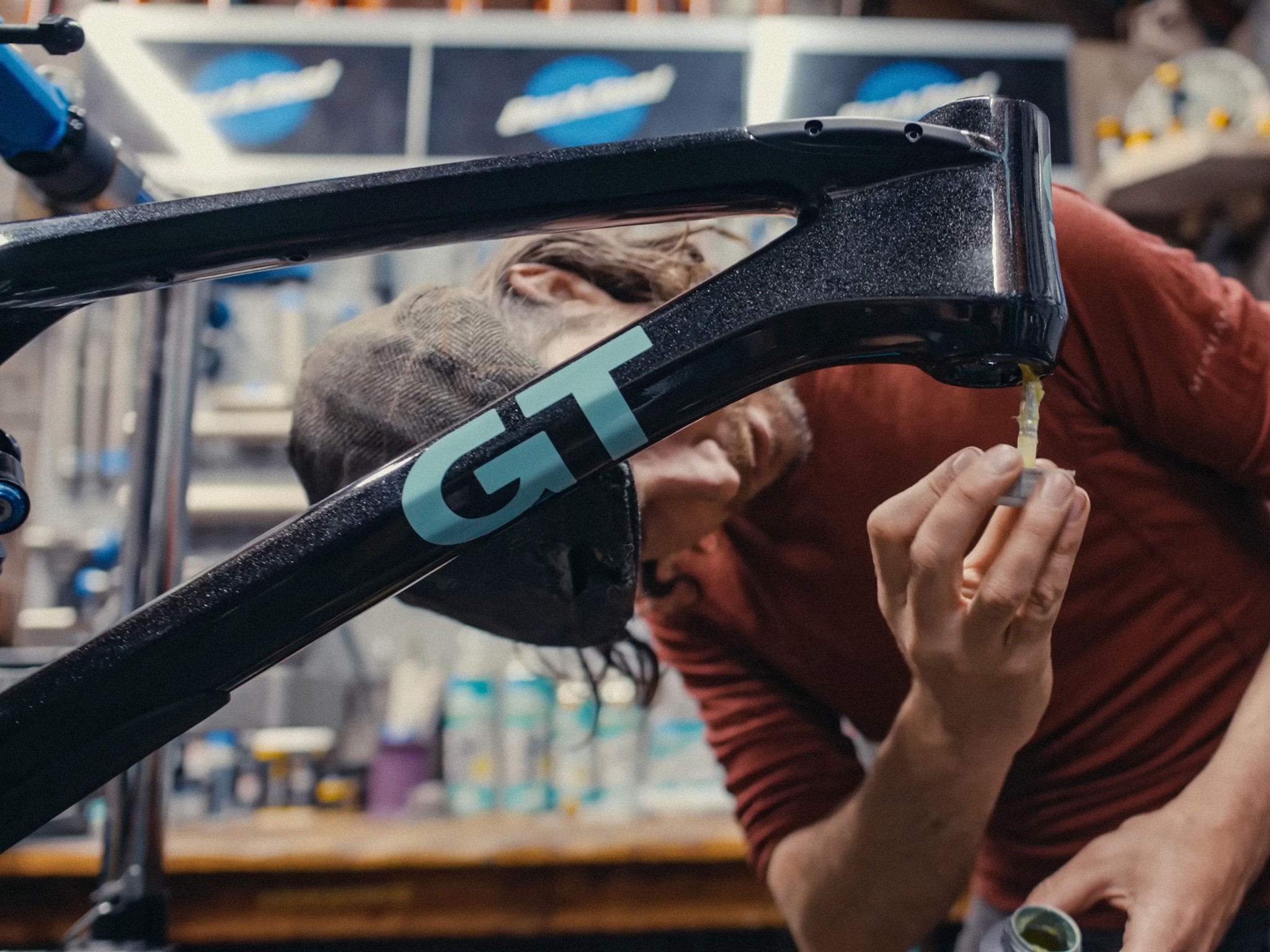
As GT looked to the future, there was a need to consolidate all the logos that were in play already, as well as find the balance between their beloved original and most recent mark.
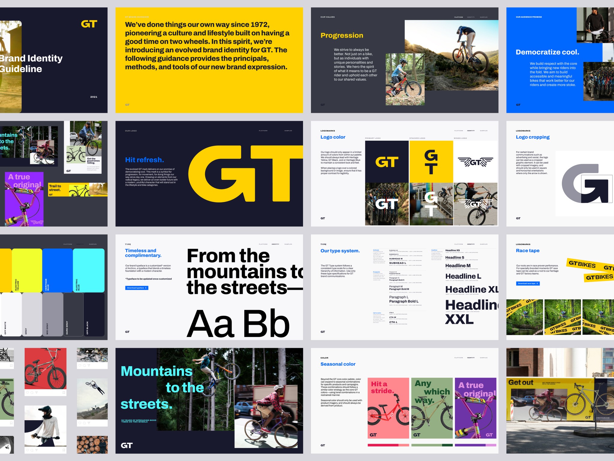
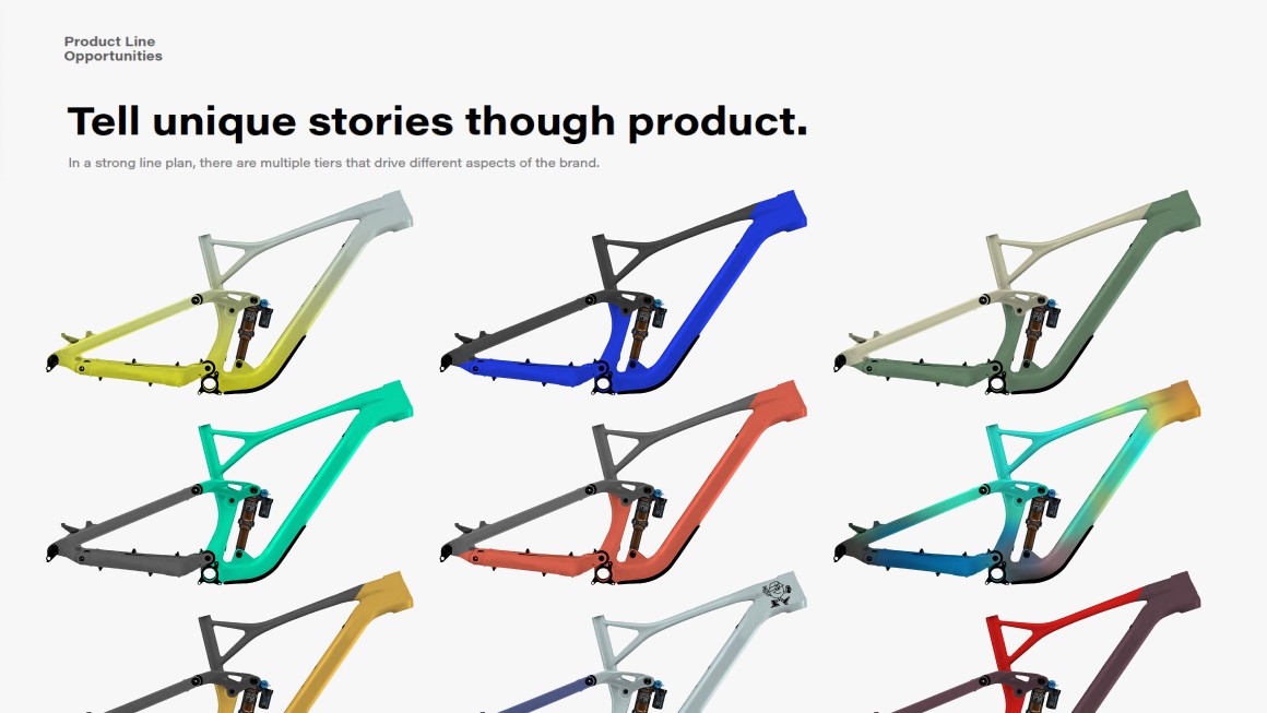
Originally pitched as part of a joint product and brand overhaul, the new visual language embracing bold color blocking was carried into frame design itself.
